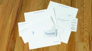
In 2012, Williams Mullen, a 250+ attorney law firm headquartered in Richmond,  Virginia, initiated a project to “rebrand” the firm which included creating a new logo design and tagline and introducing a new suite of stationery and other printed items.
The previous logo and tagline had been developed and introduced quite a few years earlier and no longer resonated with clients. The firm adopted a tagline to clearly reflect what its clients – both internal and external – believe is its core value and what differentiates it from other law firms.
About a year prior to the actual rollout of the new brand and tagline, the firm kicked off the project by enlisting the services of a design agency. The first steps in the project were to conduct a series of interviews with attorneys and other employees at the firm, as well as a number of clients, and then develop several different options for the new logo and tagline.
When the design and tagline were finalized, the firm brought ALL-STATE LEGAL into the project. As the firm’s exclusive stationery provider for many years, we understood the firm’s goals and produced numerous press proofs of the different stationery items for the firm to review and approve. Once the final designs were approved, we printed all of the items for the initial rollout and delivered them to the firm in accordance with the project plan specifications – on time and within budget.
Following the initial rollout, Doug Gardner, the ALL-STATE LEGAL Sales Representative responsible for the Williams Mullen account, continued to meet with his Marketing and Purchasing contacts at the firm to fine tune the ordering and distribution process and to provide advice on additional tweaks to the design that might enhance specific elements of the stationery suite. At the same time, the firm was continuing to collect feedback from firm members on potential adjustments and refinements to the new design.
Based on the feedback collected, the project team made refinements to the design. We then produced press proofs so that the project team could validate the adjustments to the design, which included sizing and placement of various elements. In addition to producing the press proofs, our internal typesetting and design team made several key recommendations regarding typesetting and layout that ultimately were adopted by the firm.
Rather than destroy the old letterhead we had in storage at our facility for the firm to release as needed, we were able to re-purpose the obsolete letterhead by cutting it down and binding it into memo pads – resulting in significant cost savings for the firm.
in their words
“I needed Doug’s guidance on how to incorporate our vision of things – for example the size and position of the logo on the envelopes. It was really helpful to get his input and expertise on mail standards and what other firms were doing.
“ALL-STATE LEGAL had at least 5 people working directly on our project. The team was a great help – always there when I needed them with quick replies to emails and quick answers to my questions.
“I would be very comfortable referring ALL-STATE LEGAL to another
firm that is going through a rebrand project.”
Brian Tomlinson, Purchasing Manager
“When I was first introduced to ALL-STATE LEGAL, Doug showed me a lot of samples of what other law firms were doing with stationery – from the traditional and conservative to the modern and progressive. He is always coming to us with new ideas.
“As the new brand evolved and we went through different iterations of our printed materials, ALL-STATE LEGAL was able to process orders and produce new materials very quickly.
“We need to have a print partner that is flexible and able to adapt with us, and ALL-STATE LEGAL has consistently done that.”
Tyler Harris, Marketing Manager
Planning a merger, rebrand, office move or just want to experience the ASL difference. Call your ASL account manager today at 800.222.0510.
